Blog layout is super important. It’s the first thing your readers see when they make a visit to your virtual haven. Unfortunately though, you could be the best writer this side of town but if your shop front doesn’t match the contents then you could find your readers very quickly hitting the dreaded back button… something we all want to avoid happening! Having picked up a some tips along my own blogging journey here’s a few of the things that have helped me dress-up my online design skills…
.
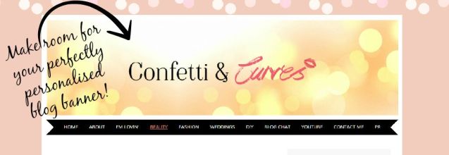
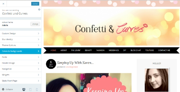
To some this may seem a bit obvious, but creating an eye catching blog banner is essential to immediately capturing the attention of your reader & portraying what your blog is all about. Can you imagine walking along the high street and none of the stores having signage above their doors? Well, in retrospect that can lead to the same calamity if you don’t get busy with your banner.
Boasting an eye catching blog banner really helps others to immediately suss out your style & personality. It doesn’t have to be perfectly smeared in colour, in fact some of the most successful bloggers have incredibly minimalistic designs but it still gives the audience an idea of what to expect and a basic branding theme that will hopefully correspond with the style throughout your posts.
“So how do I create one of my own?”
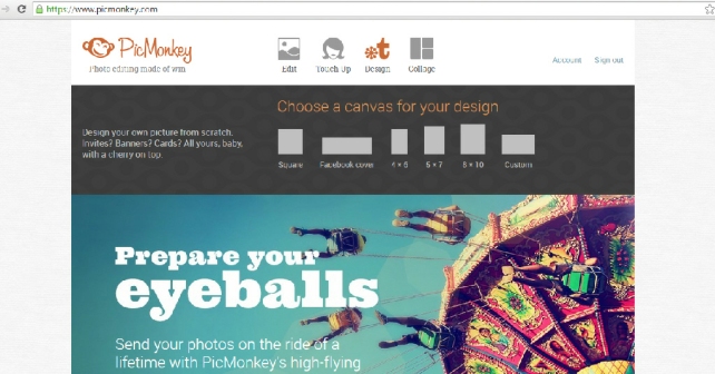
Super easy! Get yourself over to a free online editing tool (such as Pic Monkey) and simply hit the design option. Voila… you can start creating sassy looking blog banners & graphics until your heart’s content.
If you prefer, you can upgrade to the premium service for a small monthly fee which entitles you to lots of incredibly useful features with no annoying flashing ads whilst your in the depths of creativity. They have such a huge range of fonts, themes & design features on offer you’ll be spoilt for choice. If you use it half as much as I do it’s worth every penny!
.
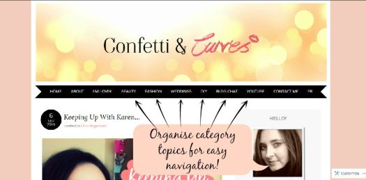
If you find yourself blogging about multiple topics then organising them neatly into their own individual categories is hugely beneficial; particularly for readers who like to quickly visit the area that peaks their interest. It’s also a great way to help keep you on top of your post organisation too. This is pretty much ideal for those who find themselves blogging about a variety of subjects such as beauty, lifestyle, fashion etc. All your posts will still appear on your blogs initial feed page but can be separated into more specific topics too.
Creating categories is something I get asked about incredibly regularly, so if you’re still working out how to master it don’t fret… we’ve all been left frantically trying to figure this quandary out at some stage or another. The most common misconception many WordPress users tend to make is assuming these are created as ‘new pages’ when in fact they’re actually ‘new categories’. For a comprehensive step-by-step guide on how to easily create your own categories *click here* for a handy link to the official WordPress tutorial guide which gives you easy to follow instructions on creating your very own category style pages!
.
Okay bloggers, this is where it gets personal. Everyone has their own unique style, vision and concept when it comes to choosing a colour scheme for their blog. However keeping the colours complimentary to each other is super important otherwise your blog page can look like an explosion in a paint factory. I always find that keeping a neutral background on my posts really helps images stand out – if there’s too much going on then it’s just confusing for the reader and begins to look incredibly messy. If you keep your colours complimentary your blog will look super professional, clean and complimentary for the reader.
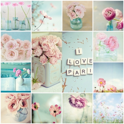
Just like you would for interior design, creating a mood board of colours you’d like to use for your blog is a great way of determining what colours you might like to stick too:
Pinterest is a huuuuuge source of inspiration when it comes to stuff like the one I found above! So pretty don’t you think? 🙂
.
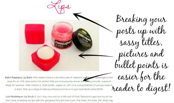
I don’t know about you guys, but I find a screen full of text utterly overwhelming & sometimes feels like a bit of hard work to get through, however there are ways to make larger posts more appealing. A great Image can speak a thousand words by using them wisely to break up huge chunks of texts so your readers won’t feel so swamped in literature. Bullet points also work a treat for keeping your layout reader friendly too as can eye catching titles!
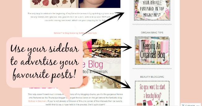
Another great tip is to use your side space to showcase some of your favourite posts. Many bloggers seem to overlook the the fact that their sidebar doesn’t just have to be for social media widgets etc but if you design an eye catching little graphic (again, Pic Monkey is superb for this) and upload it as an image to your WordPress media library you can add it to your sidebar & hyperlink it to your favourite post. Yep, it’s really that easy! Whilst your readers are scrolling down through your blog you’ll soon catch their eye & lead them onto other exciting posts they may have missed out on = great content for your visitors to check out & more traffic for your blog! Win win in my humble opinion.
.
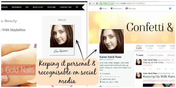
People love personality & nothing says it better than a great profile pic to put a friendly face to the person behind the blog. When most people read a post they imagine it in the voice of the creator, of course it’s so much more easier when you can put a face to the words. It’s also a really nice addition to welcome new followers onto your little online haven. Of course this tip won’t be useful for those anonymous bloggers amongst us, however you too can still inject a little bit of personality without giving away your identity by adding a fun gravatar. Okay it’s not the real thing but if your illustration is loosely based on yourself at least it gives readers a more realistic expectation of what you may look like.
When choosing a profile picture try to make it as engaging as possible. Having worked with a number of glossy magazines in the wedding industry I picked up some valuable little tips that help to really make an impact with your images. Looking directly at the camera means that when the reader spots your picture your eyes will already be firmly on them (and hopefully smiling at that!) this is why all pretty much all the shelf filling magazines in your favourite bookstore will usually have their models looking directly into the camera. Eye contact catches attention.
Don’t forget, if you’re wanting to keep everything as professional & consistent as possible it’s worthwhile having the same profile picture in all your other social media sites too. That way you’re more easily identified and very quickly recognised!
.
If you fancy procrastinating a little more and checking out some of my other on blogging then *click here* for a mini library of posts that just might help you make sense of all this virtual shenanigans.
Cheerio Chums…
…
Catch me on:

